Cycle of Good Part 2: Evaluation

IMG_2962[1]During the past three weeks, the aim of this project was to create an imaginative and wacky fashion garment, that included African pattern and inner tubes, for the Cycle of Good.

I began the project by mind mapping and then exploring Pinterest for garments and accessories that gave me inspiration for my design. Furthermore, I used my animal photography from the first part of the project as inspiration behind the African animal print and silhouette shapes.

I used a variety of techniques that I acquired in the first part project as well as developing new skills. In order to construct my skirt, I needed some patterned tie dyed material. Therefore, I researched online and found a blog post which included 16 different pattern tie dye techniques and used the instructions to create a blue triangular pattern.

Pinterest featured a range of feather inspired garments, so using certain images, I developed my neck piece to feature inner tube feathers. I used the shapes they create as a base idea and further developed the feathers to have frayed edges so that they looked more realistic and had more stability so that they didn’t curl. I decided that the inner tube was very tough to sew and would curl easily, so I stuck to cutting them out singularly and hot gluing them onto the clear plastic.

Researching helped developed my work as I aspired to create an avant-garde inspired garment, therefore perusing Pinterest was a valuable researching facility, as I was able to refine and develop my garment using the information available. Since I had never made a bralette (the top part of my dress) before, I was able to research on Pinterest, various patterns and techniques, which helped me to find an easy and informative videos.

Some of the parameters in the project were the time limit of 3 weeks to make an entire garment, and that it must include inner tubes and African animal print pattern.

I planned to finish the garment within the time scale by using an action plan; that way I would set targets that needed to be completed by the end of the week. This was going to be successful, however because of the weather constraints, I was unable to complete my garment. If extra time is offered, as well as using my self-directed time, I will be able to complete my garment, still within the time I expected to finish.

Furthermore, when designing my garment, I always based my idea around inner tubes and african print, instead of adding it later. This meant that there was more emphasis and focus on these two features instead of being a last-minute ‘add on’ that lacked uniqueness and creativity.

A problem that occurred in my design, was that the neck piece I had made, was heavy and would fold over on itself instead of standing tall. This was a problem that I predicted, therefore I decided to make a wire structure and an inner tube collar. The collar would provide more stability and comfort as well as hiding the rough plastic edges, and the wire structure would hold the neck piece up.

Since I wasn’t going to cover the back of the neck piece in inner tube feathers, the clear plastic showed the messy glue and feathers, as well as featuring an ugly metal structure. Therefore, I decided to cover the back with my leftover African sublimation print paper, so I cut them into feathers and stuck them on with double-sided tape. The paper was only going to go in the bin and I couldn’t decide what to cover up the back with, but overall I really like the pale and pastel outcome.

When I first designed my garment, I was unsure where to include my African print pattern. I designed to make the skirt of my dress using purple tie dye with blue screen printed animals. However, when I found it difficult to find a decent supply of the coloured feathers I wanted, I decided to change the colour of the tie dye to blue and integrate my animal pattern elsewhere.

This worked out for the best when I came to create my top, because I was at first unsure of how to make the design and was still experimenting with different ideas. I then was able to do further research and find a bralette style pattern that could easily let me incorporate my animal print pattern. Furthermore, to match the colours of my feathers, I used Photoshop to change the colour of my animal tie dye photograph, which I then sublimated onto fabric. After I cut out my template of my fabric, I used the leftover off cuts to create a matching halterneck strap.

Overall, I’m very pleased with my design and garment, because even though I changed things and different emblems occurred, it all helped to shape and develop my garment into a more Avant-Garde and imaginative piece that had a glint of style. As my first proper sewing challenge, I think I handled the task well and tackled things step by step. Internet researching certainly helped in the designing and using beginning sewing books like ‘Sew step by step’ by Alison Smith gave me advice on how to do/learn new skills to improve my garment. I enjoyed designing something that looked tricky to make, and perceiving and finding solutions to make things work, as doing something challenging spurs me on to learn new skills and processes. I think I answered the brief very well, as my design amalgamated tough and sturdy inner tubes with intricate animal print, to create an eccentric and imaginative garment.

Animation Evaluation

During this project, we were asked to design and create an animated logo for the charity, Cycle of Good. The animation had to be simple but still represent their ethos and aims effectively. Even though I had no prior animation knowledge, I think my animation turned out quite well and gives a simplified version of what the company is about and it’s aims.

When I began to brainstorm ideas, I thought the best way to portray the company, was to feature bike wheels in my animation therefore, I came up with numerous ideas that featured wheels rolling together or just turning in general. I chose my 3 favourite ideas to create storyboards from, and decided to animate an idea which involved an elephant turning into an infinity with the words Cycle of Good written inside it.

I attempted to animate this design, however I soon realised it didn’t portray anything remotely about Cycle of Good and that it would also require lots of hand-drawn frames. Based on this, I switched to an animation based on the idea of cogs rotating and turning into wheels with people and the words Cycle of Good appearing after every turn. This animation would still require lots of work to draw each element and make new layers for every rotation, but I chose to perceiver as I knew it gave an effective portrayal of the company’s ethos.

My animation meets the brief and works within the parameters for many reasons. I chose to use cogs in my design because when you abbreviate Cycle of Good, you get cog. Furthermore, cogs are known to provide a knock on effect, that one turns the other and so on, therefore my animation is trying to portray that your actions e.g donating an inner tube, can have a good knock on effect.

Originally, I wanted to have the people in my animation transition from sad faces to happy faces with their hands up. However, since the animation already required a lot of drawing and because of the time limit, I decided to simplify it and stick to happy faces with arms down. I also think it would have been a distraction from when the writing appeared.

When it came to developing and refining, at first I didn’t know what I could do to improve it apart from just tidying things up. I then had the thought of perhaps reversing it from transitioning cogs to wheels and instead transitioning from wheels to cogs. I did this because the inner tubes are the main starting point so without them the cogs aren’t in motion, no wheels = no cogs.

If I were to develop it further, I would somehow try to incorporate one of the final products into the animation. I would do this so that it would be like a chain of events so that one follows the other.

Furthermore, If I made another animation I would like to create one that incorporates two worlds, one where nothing is recycled and everything goes into landfill contrasting with another world where Cycle of Good exists and the world is a better place. I’m unsure of the logistics, as it’s just an idea but that is the main synopsis.

Cycle of Good Part 2: Week 1/Week 2

IMG_2598[1]I began the week by creating a mindmap featuring my possible outcomes, techniques and processes. As my mindmap developed, I knew I wanted to do something with feathers as I thought it would be interesting to try making them from inner tubes. From this, I created a Pinterest board featuring a range of Avant-Garde, African and animal inspired fashion. These together helped me create a wide range of thumbnails, which included inner tube head pieces and flared fringe boots, to laser cut inner tube skirts and dresses made from feathers. I then developed my ideas into detailed colour drawings, however I couldn’t decide which one I liked best. I picked out different elements from each design that I wanted to include, then I created 4 more designs featuring feathers, milk bottle tops and laser-cut inner tube.

Even though I picked one of these to be my final design, I’m still unsure about it and it doesn’t say ‘wow’ to me. However, I think once I do some tests and samples, I think I will add and tweak my design to make it look more crazy and bonkers. Regarding the design that I did pick, I’ve decided already to not have the bottle tops multicoloured, and instead spray paint them silver or gold.

While designing, I had to predict problems with my designs and create solutions, so that I’m more prepared when I start to produce my design.

In my design, I have an inner tube feathered neck piece that, because of the weight, will fall down, so I thought it would be a good idea to create some support. I thought about using cardboard or wire to attach to the back so that it holds its shape and doesn’t fall down.

Another problem I predicted with this neckpiece, is that I won’t be able to sew the layered inner tubes. A solution to this would be to hot glue the feathers onto a piece of clear plastic, so that I’m able to attach the feathers easier to the dress.

Before I started my design, I did some tests and samples of my neckpiece, by using some of the clear plastic and sticking offcuts of inner tubes, with double-sided tape to make a mini marquette. Even though I didn’t use hot glue, it still worked quite well and gave me an idea as to how the shape would look.

When I started making my design, I made my template then proceeded to make my feathered neck piece. I soon found out that cutting up inner tubes into 15cm feathers was going to be a long and laborious task. I initially planned to have the piece as all black inner tubes, however to speed up the process and to inject more colour into my design, I decided to add some coloured craft feathers to fill in the gaps.

Ideally, I wanted purple, blue and black feathers to fill in the gaps so that the colours would match the dye tie and African fabric I planned to include in my design. However, the packet was mixed, and the majority of the colours were orange, red, green and a small amount of blue and yellow. I decided to use red, orange and yellow feathers, and I think it would be a wise choice to change the colour of my tie dye dress as I don’t think purple and blue would go well with it.

At first, I wasn’t sure how to do the top part of my dress, however after doing some research, I’ve decided to make a plunging halterneck top decorated with inner tube feathers. I think I’m going to change the colours on my sublimation print to yellow or orange to contrast with the neon blue tie dye I’m going to use for my skirt, yet still tie in with the feathers I’ve used.


The development process and evaluation of my inner tube pencil case

The purpose of this project was to create a recycled inner tube product, that was useful, resourceful and creative! From 8 designs of various everyday items, I decided to create a pencil roll (aka a pencil case that rolls up). I chose to develop and produce this item, simply because pencil cases are widely used around the world and I can assume every household has at least one. What separates my design from the usual ones you buy, is that I wanted to create a case that doesn’t require extra fastenings like zips, as they normally end up breaking or get stuck, and then what do most people do? They throw them away. In such a wasteful world, the more reusable and up-cycled items, the better. When considering the target audience of ‘Cycle of Good’, I think it fits quite well. As I said before, it’s a very common item, therefore these people may well have children or grand children attending school who would most likely appreciate this useful item.  My product adheres to the company ethos and because no extra equipment or parts are used, it should be relatively inexpensive. Since the design is quite simple, using the instructions and templates, the tailors in Africa, would hopefully find it easy to construct this item.

Throughout this project, I was constantly developing my design so that the final outcome would be the best version. Consequently, what I initially designed and developed is quite different to what I created in the end. I even made alterations to my final design, when I needed to do some problem solving.

Through the development I changed the way it was fastened; the size of the pencil slots; how the inner tube backing was constructed from weaving to sewing; and finally the way the pencils could be stored/held in position.

As I was designing my idea on paper, I was experimenting with different ways to fasten the item together when rolled up. I knew I didn’t want to use any press studs or zips so I decided on straps. These straps evolved from 2 straps and a loop on either side, to 1 strap on either side. However, when it came to creating the item, I realised one of the straps would be rendered useless once it was rolled up. Therefore, I changed my design to having both straps on one side.

When I was doing my final design, I needed to include measurements of the pencil slots and estimated how much fabric a pencil would need. After doing some research, I realised I had miscalculated by quite a bit. This meant that I wasn’t able to include as many pencils as I had planned. Therefore, I had to recalculate using the correct measurements and see how many pencils I could fit. This may have been a problem but it lead me to the though that this item could be multipurpose and not just labelled as a pencil case. With a few modifications in the length of the actual item, I realised you could create whatever sized pocket you want for different uses.

Some ideas I came up with were:

  • Travel makeup brush case
  • Knife case
  • Cutlery holder for picnics. It could also double up as a placemat because of the inner tube grip-like texture
  • Paint brush case
  • Sewing kit case
  • Tool holder
  • Travel toiletry bag
  • General travel kit for essential items. Useful for long haul flights to store your toothbrush, glasses etc
  • Passport and boarding pass holder. This product would fold in half inside of roll up.

This means Cycle of Good could broaden their market and peak the interest of various trades. All these ideas can be made with same basic structure, and all that needs to be changed is the length of the fabric and the width of the pockets. A few of these ideas are travel based, which could be helpful, seen as though they have strong links with a company who sells phones to international travellers.

Since I completed this project at home, I was limited in certain ways, however I tried my best using what I had.

Since I didn’t have the material to make a template from, I used brown paper instead. I also didn’t have a board that had grid measurements on it, so I struggled to get a perfectly measured rectangle using a ruler and a protractor. This is why my final design looks wonky in certain places, however it still works and I’m sure the people in Malawi will understand the way it should have been. Furthermore, when I get access to the template material and measuring boards, I will make the templates, so that the people in Malawi can create a better design.

Another downside was that I did not have any fabric in which to create a mock-up. So essentially, my final design is my mock-up, which meant that all my mistakes and mess-ups are included into my final product. The point of a mock-up is to help you understand what you did wrong, and how you’ll learn from it to improve, the next time you make it. Like the templates, when I have some fabric, I will make my design how it should have been instead of being a mock-up. However, one thing good that came out of this, is that I learnt about how difficult it is to sew inner tubes. If I had made my mock-up from fabric, I would assume that my design would be easy to sew and pin, but it wasn’t. Your mock-up could be perfect, but because the material is completely different (harder to sew as well as being bulky), it may turn out the opposite of perfect.

Before I started sewing, I did a little sample, and it actually turned out quite well and I assumed it would be quite easy to sew the inner tubes. Since the originate from a circular design, they aren’t straight, which means that you can’t bend them into shape and they end up bunching. This is another reason why my design didn’t work. I attempted to sew three ‘straight pieces’ of inner tube in order to make a flat rectangle. Earlier in the development, I changed my design from weaving inner tubes to cutting pieces and sewing them together. On second thoughts, I think it would have been a better idea to weave the pieces as they would have been flat. I don’t know how I would have held them together while I was sewing them though. Since they kept bunching up, my design ended up smaller than I intended it to be, because I had to keep cutting off lengths to make it flat. I designed to make the slots for my pencils, out of inner tubes, however once I knew how temperamental the inner tubes were, I decided against and used the other piece of fabric I had. I had already changed my mind about the way I was securing the pencils, from 1 cm slots to one big pocket, with sewn sections. The small slots wouldn’t have worked anyway with fabric, and I like the design better with the pastel fabrics against the opaque animals.

Since the inner tube comes from a circular object, when it is lain ‘flat’ it has a curve, so if you want it to be straight, bunching occurs. This was a reason behind why I wasn’t fully content with my final piece as the inner tube was bunching and causing my cloth fabric to pull and therefore my design kept getting smaller and smaller. If I were going to do this again, I would stick with my original idea of weaving, because this means you can cut the pieces in straight strips and after it has been woven, it will be flat and much easier to sew. A quick fix I could have used on my final piece was to sew the pockets sections, AFTER I had finished all the sewing, that way the inner tubing and fabric would lay against each other and there probably would have been less bunching. The reason I didn’t do this is because I had already sewn the pockets and then I would have had white stitches and thread showing on the back of the inner tubes, which would eradicate my pristine inner tube design.

In my final design I planned to make my product bigger than it actually turned out, which was because of two problems. The first reason was because the screen-printed tie dye was too small length ways of the design I wanted. If I was to make my design to the correct measurements, then I would have had to have my pattern landscape, which also meant that the messy end of my screen print would show. Therefore, I decided to alter the measurements of my design to improve the aesthetic. The other reason my design was shorter, was because of the ‘bunching’ I mentioned in the previous paragraph, so I constantly had to cut down my design in order for the inner tube to be straight.

In order to create a stitchless finish, I turned my design inside out, which meant I had a gap at the top to sew. After doing some research, I taught myself a simple stitch which conceals the seams called the Ladder stitch aka ‘The Invisible Stitch’. I’m really glad I was able to incorporate this into my design, because not only have I learnt a new technique, it creates a perfect finish.

Overall, I think I did my best in an awkward situation and applied myself with what I had to try to create a worthy product. Although the product could have been better in certain ways, the pencil case is still effective and performs the way I expected it to. I have learnt from my mistakes and parameters, which will only help me create a better textile piece next time. I think my product meets the design brief and targets the audience, Cycle of Good want to sell to.


Company Animation Logo Analysis

  • Shazam

Seeing as though Shazam is a company that lets people find out what song is playing, this logo seems very apt by using the sound beats as animation. I like how the only movement in the animation are these sound waves because it applies that if everything in the world stops or in the darkest of moments, music is still alive and keeps things going. The movements are very circular and flow very well and I could compare it to a flame. Maybe they used this because for many people, music is a burning passion and it also reminds everyone that music will always be there. The colours used remind me of disco lights and make you want to dance.

Turbaba, Oleg (2014) Shazam Logo Concept. Available at: https://dribbble.com/shots/1498149-Shazam-Logo-Concept Accessed: 09/02/18

  • Giant Owl Productions

This logo consists of two ‘owl looking eyes’ with rotating pupils, made to look like a film real. Obviously, by the name of the title, I’m assuming this company has something to do with film making, but also because of the way they have designed the eyes to look like an old film in action. The reason why they chose to use an owl is unknown, however many people relate owls to wisdom, so perhaps by using this company they are trying to tell you it’s a wise choice. The actual company is a production company who specialise in telling a story through film campaigns.

Giant Owl (2018) Homepage About Us Available at: http://www.giantowl.co.uk/ Accessed: 09/02/18

HOW staff (2015) 16 Animated Logos to Check Out. Available at: http://www.howdesign.com/featured/animated-logos/ Accessed: 09/02/18

  • Faymus

This logo is animated simply as though someone is handwriting each letter at the same time. The animation is simple and doesn’t require any fancy effects, but perhaps this has more meaning behind it than you think. Each letter is written at the same time, suggesting that everyone is trying to be ‘faymus’. Although the wordplay hasn’t got anything to do with the animation, the way it ends with ‘mus’ could suggest that people think its something they ‘must’ do. during the animation, the logo is written in strokes and is perfect with no mistakes. This could be a hint at what the company is about, suggesting it’s a place where perfection and high quality is key. At first I thought this company was a recruiting or casting company because of the name, however on further investigation, I found out it’s a property developing company who specialise in building intelligent, sustainable spaces and ecosystems. This explains why the logo emanates sophistication and precision, however it still doesn’t explain why it’s called Faymus.

Baird, Richard (2018) Opinion on Faymus by Studio Brave Available at: http://bpando.org/2015/12/03/logo-design-faymus/ Accessed: 09/02/18

Animation Techniques

Stop Motion/Clay Motion

What it is and how it’s made: This type of animation involves moving models in tiny amounts and taking a picture after. The photographs are sequenced together to create a smooth action clip of characters moving. This technique may be simple for beginners, however it’s very time-consuming.

Famous Examples: Wallace and Gromit, Coraline and The Nightmare Before Christmas

Find out more:

Wikipedia (2018) Stop motion. Available at: https://en.wikipedia.org/wiki/Stop_motion#1960s_and_1970s Accessed: 09/02/18

Basile, Nancy (2017) Animation Techniques for Beginners. Available at: https://www.thoughtco.com/animation-techniques-for-beginners-137590 Accessed: 09/02/18


Cut Out/Collage Animation

What it is and how it’s made: This technique uses characters or models cut from paper which have either been drawn or painted. Like stop motion, the cut outs are moved as pictures are taken.

Famous Examples: Southpark

Find out more:

Wikipedia (2018) Cutout Animation. Available at:  https://en.wikipedia.org/wiki/Cutout_animation  Accessed: 09/02/18

Basile, Nancy (2017) Animation Techniques for Beginners. Available at: https://www.thoughtco.com/animation-techniques-for-beginners-137590 Accessed: 09/02/18


Rotoscoping

What it is and how it’s made: This is created by tracing over actors, on top of film to get smooth human movement.

Famous Examples: Cinderella, Snow and the Seven Dwarfs and Pinocchio (Walt Disney)

Find out more:

Wikipedia (2018) Cinderella. Available at: https://en.wikipedia.org/wiki/Cinderella_(1950_film)#Animation Accessed: 09/02/18

Basile, Nancy (2017) Animation Techniques for Beginners. Available at: https://www.thoughtco.com/animation-techniques-for-beginners-137590 Accessed: 09/02/18


Cel Animation

What it is and how it’s made: When we think of cartoons, it’s usually the cell type animation. This process is done by painting each frame on transparent cellulose acetate, with a painted background beneath it. Each individual cel is then photography with their coordinating background and is then created into a film. This long and expensive process is hardly used nowadays and instead animators use computers to help speed up the painting and photography.

Famous Examples: The Simpsons, Adventure Time and The Lion King

Find out more:

Basile, Nancy (2017) Animation Techniques for Beginners. Available at: https://www.thoughtco.com/animation-techniques-for-beginners-137590 Accessed: 09/02/18

Wikipedia (2018) The Lion King. Available at: https://en.wikipedia.org/wiki/The_Lion_King Accessed: 09/02/18


3D CGI

What it is and how it’s made: Computer generated imagery is a form of animation where filmmakers use software to create detailed and realistic models. Not only is it used to make complete films and shows, it’s also used for special effects as well as stop-motion and 2D animation. 3D animation is a common form of CGI which requires just as much work as normal 2D cel animation. This is because animators want to create realistic characters and that requires making detailed models with shading and textures.

Famous Examples: Toy Story, Despicable Me and Finding Nemo

Find out more:

Wikipedia (2018) List of computer animated films. Available at: https://en.wikipedia.org/wiki/List_of_computer-animated_films Accessed: 09/02/18

Basile, Nancy (2017) Animation Techniques for Beginners. Available at: https://www.thoughtco.com/animation-techniques-for-beginners-137590 Accessed: 09/02/18


Flash Animation

What it is and how it’s made: This type of animation is made using software like Adobe Flash, in which characters are made through vector-based drawings.

Famous Examples: Peppa Pig, My Little Pony: Friendship is Magic and The Mr. Men Show

Find out more:

Wikipedia (2018) List of Flash animated television series. Available at: https://en.wikipedia.org/wiki/List_of_Flash_animated_television_series Accessed: 09/02/18

Basile, Nancy (2017) Animation Techniques for Beginners. Available at: https://www.thoughtco.com/animation-techniques-for-beginners-137590 Accessed: 09/02/18

Week Fifteen and Sixteen

During the past two weeks, I continued researching African animals and ideas for my prototype for the Cycle of Good project.

After reading the brief and researching on Pinterest, I came up with 8 initial ideas which included:

A backpack (including a side reusable water bottle pocket) I decided not to pick this in my developed designs because I think there are already so many companies making bags, we don’t need more and this project is about reducing what we don’t need and pursuing a reusable lifestyle. I also think the design may have been too complicated to complete using the limited resources in Malawi.

A bag (can be worn around the waist as a bumbag or over the shoulder as a small purse) I chose to develop this idea because it has multi uses for different occasions. It can be worn either on one shoulder or around the waist depending on your preference. I decided to make it small so that it encourages people to only take items that are essential instead of hoarding and promoting a minimalist and zero waste lifestyle. The strap is designed to be sturdy enough to clip on other items and is adjustable to the size you would like. During the development I decided to change the shape from rectangular to a more rounded design. This is because I think it makes it sturdier and there are no more corners for tiny items to get stuck in. I didn’t choose this as my final design because I think the target audience may use my other products more, as they are more designed for everyday use.

A pencil case (using a one piece roll-up design and fastened using a strap and loop) Since pencil cases are widely used around the world, I wanted to create a design that didn’t require extra fastening like zips, that always break and a classic yet exciting design. During the development, I changed the sizing of the slots used to hold the pencils, so that you can fit a variety of shaped stationary. Regarding the classic yet exciting design, the outside was supposed to be plain black woven inner tube with the inside rolled out as a bright and colourful chitenge pattern. I chose this to be my final design to I made the change of sewing together inner tubes instead of weaving so that the structure is less rigid and more flexible. Considering the age group, these people may have children or grandchildren attending school, therefore this item would be extremely useful and colourful gift, as well as educating them about the cause they are contributing to.

A jewellery case (similar to the pencil case with the roll up design except different attachments are used inside to hold the jewellery) Since I chose the pencil case design I decided not to choose this idea. This is because, the main structure of the pencil case is the same as the jewellery case, therefore the design could easily be adapted by the people in Malawi if they thought it was a good idea. I also didn’t choose this design because it would require equipment to secure fastenings and I wanted all my designs to be made without having to buy extra equipment.

A placement (a woven inner tube design with both sides being reversible to use) Although, I think placemats are a good idea, i think they are more decorative than useful. The design I created probably would have made it hard to clean and since this project is a able reducing and reusing, I don’t think it fit the brief.

A toiletry bag (one that rolls up and is able to hang) I didn’t choose this to develop because, although a hanging travel toiletry bag is handy, I think the contents would be too big and bulky for it to roll up, which defeats the whole purpose.

2 belts (no buckle design but using different shapes) Since the equipment in Malawi is limited and is trying to limit the costs to provide a better profit for the tailors, I wanted to keep the costs low by not using a buckle and just relying on the inner tube. I kept the idea simple and similar to a classic belt so it would appeal to more people as well as developing it for different people with a variety waistlines. This is my second choice for my final design, so if the paper template succeeds, hopefully I will be able to create a reversible buckleless belt.

In order to create the best chitenge fabric, I began to develop different animal geometric patterns using silhouettes of animals and arranging them around shapes. I really enjoyed doing this because although you can’t see the animal in full detail, just a silhouette, it suddenly becomes part of a motif of a completely different shape. Eg. one of my motifs is composed of two giraffes facing each other, repeated on each side of a square in the middle; when you take a look at the motif as a whole, it looks like a strange african flower.

Using my pictures from Chester Zoo, I created 3 patterns using the silhouettes of animals and various geometric shapes. I morphed animals together to create weird shapes and tried to tell a story using different animals. My favourite design (which I lasercut later for screen printing) consisted of two giraffes facing away from each other and instead facing a lion. I placed a circle in the centre of the two giraffes and I like how it almost portrays an african sunset. Unfortunately, when I lasercut my design, the giraffe legs were attached to a rectangle so my design didn’t look/turn out exactly how I wanted it and you can’t really tell what animal it is.

To create our ‘chitenge’, we needed a colourful background to screen print onto, therefore we did two different techniques called wax batik and tie dye.

I really enjoyed experimenting with folding the cloth to make the tie dye. I wanted to create something a bit different, so I went online and found a website which showed a variety of techniques and how to do them.
http://www.bystephanielynn.com/2015/06/tie-dye-folding-techniques-16-vibrant-tie-dye-patterns-tiedyeyoursummer.html

Out of the 16 techniques, I recreated the ‘Spiral Tie Dye’ and the ‘Accordian Folded striped Pattern’.

‘Accordion Folded Stripe Pattern Tie Dye Technique
Lay the fabric flat.
Accordion fold the fabric from the bottom up.
At this point you will have a long strip of fabric. Fold the fabric in half.
Secure the fabric with four rubber bands, evenly spaced as shown above.
Apply the dye to the fabric.
Flip the fabric over and repeat on the backside.

Spiral Tie Dye Technique
Lay the fabric flat.
Pinch the fabric in the center.
Begin twisting the fabric in a circular motion and continue until all of the fabric is in a spiral shape.
Secure the spiral with three rubber bands, creating a wedge effect, as shown above.
Apply the dye to the fabric.
Flip the fabric over and repeat on the backside.’

Lynn, Stephanie (June 2015) Tie Dye Folding Techniques. Available at: http://www.bystephanielynn.com/2015/06/tie-dye-folding-techniques-16-vibrant-tie-dye-patterns-tiedyeyoursummer.html Accessed: 30/01/2018

I like my spiral design more because it’s memorizing and simplistic, however I like the accordion fold because it encompasses so many colours and looks similar to African tie dye. If I were to do it again, I think I would include more colours in the spiral design like a blue and perhaps not use the green, as it doesn’t suit well with the pinks.

The other technique, wax batik, was slightly more difficult and in my op
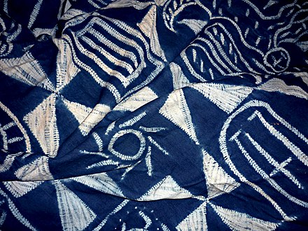
inion, the design wasn’t as nice. For this to work, I think you need a very simple design with as little detail as possible and the bigger the image, the better. It’s obviously hard to control the hot wax and you have to act very fast, which isn’t how I like to work. It’s an interesting process and I actually didn’t mind my design afterwards, because you can tell its a giraffe with its patches around it. However I wouldn’t do it again, unless I was making a geometric shape pattern or that there was an alternative method. I thought perhaps that using a wax crayon would provide a more accurate design, however you can’t see where you’ve drawn so maybe it wouldn’t work as well after all.


Once I had my stencil and fabric, I wanted to screen print using a light pink paint, however, that would have made my design too faint, so I decided to go with a bright blue. I actually found screen printing quite difficult, because you don’t know if you’ve done it right until the end, and it if its wrong, you can’t do anything about it. The idea to keep the squeegee at 45 degrees is quite hard and I had a difficult task of making sure the paint has been evenly distributed. This is the reason why a lot of my screen prints didn’t work out. i also think the screen prints looked the best when some black was added because the colours contrasted really well, compared the bright blue. Although it didn’t quite work out, the final fabric pieces actually look nice, especially the spiral tie dye with black ink. I would do it again because I think screen printing is a technique that you have to practice to get perfect, so I suppose it’s not bad for a first time try.

Since my first final design was quite simple, I decided to see if I could do two prototypes. I chose to do the roll up pencil because it’s a simple design but I think its a very useful item. I’ve decided to sew together my inner tubes together for the back instead of weaving, as I think bits could collect inside and it would make it more flexible. On further development, I think I will change the structure on how the pencils will be secured. Instead of small slots, I think I will make it into one long slot, as I think the stitching will be easier,hold in place better and make the overall product look more aesthetically pleasing.
Regarding my belt, I think I will make a paper template and see if that works before I dive in and make it. This is because I’m sceptical about it working with such thin material and I also don’t know how long to make it because of the buckle attachments.

Health and Safety

During the batik, care needs to be taken not to touch the hot wax or get it on the floor. This is why it’s done inside the fume cupboard; to avoid mess on the floor and also because of the fumes it gives out.

Before screen printing, it’s best to wear clothing protection like coats to avoid getting paint on your clothes. After printing, the screens need to be throughly cleaned, which is why a power washer is used inside a fume cupboard to prevent mess/hazards.

African Textiles

Africa is home to 54 countries which vary in culture language and ethnicity, therefore there are a range of traditional textile techniques. Below are some of the most popular african textiles and the history behind them.

Akwete Cloth

Where: Akwete in Abia State, Eastern Nigeria
Who: The Igbo women
Features: Mostly straight line and geometric shape patterns. No more than 4 motifs are featured on one side of the design.
Materials: Can be woven using silk, tree bark, wool, raffia, hemp and cotton.
Uses: To determine your social status as certain motifs are only worn by pregnant women, warriors and royalty.
Worn: Often worn as a two piece set.

Wikipedia (2017) Information and Images on African Textiles. Available at: https://en.wikipedia.org/wiki/African_textiles (Accessed: 17 January 2018)
Bello, Ebun (2017) Information and Images on Akwete Cloth. Available at: https://zoede.com/akwete-cloth-eastern-nigeria/ (Accessed: 17 January 2018)
Nwachukwu, McPhilips & Oziogu Ibebabuchi Appolos (2017) Information and Images on Akwete Cloth. Available at:
https://www.vanguardngr.com/2012/07/akwete-cloth-an-igbo-textile-art/ (Accessed: 17 January 2018)

Ukara

Where: South East Nigeria
Who: Male Nsibidi artists design the cloth but they are dyed in secret by post-menopausal women or in public by young men.
Features: Many designs feature the Nsibidi ideographic alphabet and mostly includes symbols that communicate power and nature-based designs like leopards, feathers and crocodiles.
Materials: The woven material can be dyed in green and red but is most commonly dyed indigo.
Uses: To represent power and wealth in the form of symbols
Worn: It is worn by Ekpe groups or the Leopard Society as a wrapper or can be hung on a wall at important events.

Forster, Dayo (2014) Information  and Images on Ukara Cloth. Available at: http://toghal.com/2014/07/behind-the-scenes-ukara-cloth/ (Accessed: 17 January 2018)
Wikipedia (2017) Information and Images on Ukara Cloth/Nsibidi. Available at: https://en.wikipedia.org/wiki/Nsibidi#Ukara_Ekpe (Accessed: 17 January 2018)

Aso Oke Fabric

Where: South West Nigeria
Who: Yoruba Tribe
Features: Traditionally the motifs would come from folklore and fables, however modern designs now include animal and floral motifs.
Materials: The three traditional types of Aso-Oke have different colours and are made from different materials. Etu is a very simple dyed indigo cloth with light thin stripes. Sanyan is woven from cotton yarns and anaphe wild silk from moths, therefore it remains a pale brown colour used for weddings. Alaari is woven from cotton Worn/Uses: The woven fabric is used to make Iro (wrappers), Agbada (gowns) and Fila (hats). Traditional garments for women include a buba, an iro, a gele and a pele. For a Yoruba man it includes a buba, a shokoto, an agbada and a fila.

Dolapo (2017) Information on Aso Oke fabric and traditional Yoruba clothing. Available at: http://www.urbanstax.com/beauty-aso-oke-traditonal-yoruba-clothing/ (Accessed: 17 January 2018)
Wikipedia (2017) Information on Aso Oke fabric and imagery. Available at: https://en.wikipedia.org/wiki/Aso_Oke (Accessed: 17 January 2018)

Bogolanfini (Mud Cloth)

Where: Mali
Who: Bambara Tribe
Features: Each cloth tells a different story and the symbols involved were originally codes that only a selection of people could understand
Materials: Cotton, dyed with fermented mud
Uses: It’s a symbol of Malian cultural identity
Worn: Hunters wear it as camouflage and women are wrapped in it after transitioning into adulthood.

Wikipedia (2018) Information on Mud Cloth and Imagery. Available at: https://en.wikipedia.org/wiki/B%C3%B2g%C3%B2lanfini (Accessed: 17 January 2018)
Azzarito, Amy (2014) The History of Mud Cloth and Imagery. Available at: http://www.designsponge.com/2014/07/past-present-behind-mud-cloth.html (Accessed: 17 January 2018)

Kitenge/Chitenge

Where: Most Regions of African
Features: No recurring motifs included, often just decorated with lots of traditional tribal patterns and a range of colours. That being said, many of the designs have political and religious meaning translated through the designs.
Materials: Traditionally it was made by sewing leaves and grass together but is now made using the batik technique.
Uses: This multipurpose fabric is used to filter dirty water and as a baby carrier, as well as being used commonly as clothing.
Worn: They are often given as a gift to young women and are usually worn by women at funerals in Malawi.

Baldwin, Jamie (2004) Chitenge in Zambia and Imagery. Available at: http://www.bbc.co.uk/nottingham/content/articles/2004/10/05/features_2004_10_our_man_in_zambia_14_feature.shtml (Accessed: 17 January 2018)
Wikipedia (2017) Information on Kitenge and Imagery, Available at: https://en.wikipedia.org/wiki/Kitenge (Accessed: 17 January 2018)

Cycle of Good Live Project/Week Fourteen

cog
http://www.beehivemw.org/cog.html

The first part of our topic ‘Made to Measure’ is all about designing and creating an item, for a project called Cycle of Good.


The Krizevac Project is an organisation which endeavors to transform deprivation into prosperity, not with money donations, but by giving people in Malawi the opportunity to earn an income, whilst tackling unemployment.  Their project Cycle of Good, involves training Malawian people, to become tailors and then helping them hand-manufacture useful products, made from inner-tubes. They then buy back these goods and sell them in the UK, America and Japan. Their products are aimed for use by people in the West, however most of their consumers are generally people, who are interested in taking care of the environment and living a low waste lifestyle.

The first outcome for this project will be a prototype, that has the possibility to be recreated by the tailors in Malawi. After doing some research, I’m interested in making a roll up pencil case, woven placements and coasters, a no buckle belt or a money belt/bag.
Outcome two will be a garment of my choice, possibly continuing with the theme of african surface pattern or using the idea of upcycling materials, that would usually end up in landfill.

Regarding surface pattern design, I’ve been researching Tanya Mushayi, a Zimbabwean designer, who sells colourful kintenge inspired clothing.